Return to Home
Dropbox Search Operators
Reducing time-to-success in Dropbox search for millions of daily active users
Project overview
On the Search team at Dropbox, we were focused on how to enable our users to spend less time searching, and more time doing. We saw an opportunity to implement a highly-requested feature, so I sought to identify the real problem our users were facing, to see if and how it made sense to implement this feature.
The problem
Dropbox users couldn't find files they knew existed. The loudest feedback came from power users demanding Boolean search, but that was only a symptom, not the real problem to solve. Most users don't remember a file's exact name. They remember one clue: a file type, a rough date, a collaborator. Our search didn't support that mental model.
Reframing the opportunity
I resisted the push to ship operator syntax as a feature checklist. The underlying need wasn't "Boolean search" — it was confidence in search results and the ability to refine a query without knowing the right vocabulary. That distinction shaped every design decision that followed.
My role
I led design from discovery through phased rollout, partnering with a researcher and two engineers. I was responsible for problem framing, concept exploration, experiment design, and cross-functional alignment on the phased strategy.
Key insights
Operators are a power-user tool being introduced to a general-audience product. The design had to work for someone who'd never heard of Boolean search while remaining useful to someone who lives in the terminal. Discoverability and validation — not syntax — were the core design problems.
The design
I proposed a phased rollout to reduce risk and learn incrementally rather than betting on a single solution:
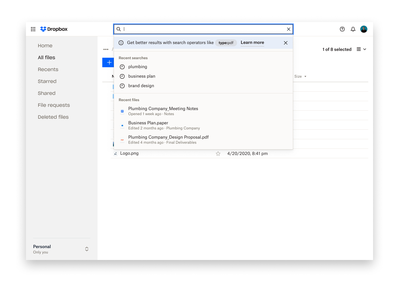
- Phase 1 validated that operators improved time-to-success for users who encountered them, using a minimal treatment. Mirroring filter selections as operator syntax in the search bar bridged the gap between familiar and new interaction patterns.
- Phase 2 introduced contextual education via suggestions at the empty state and inline hints based on query input.
- Phase 3 (north star) envisions a dynamic search bar that surfaces operator suggestions based on predicted result quality and prior searches.
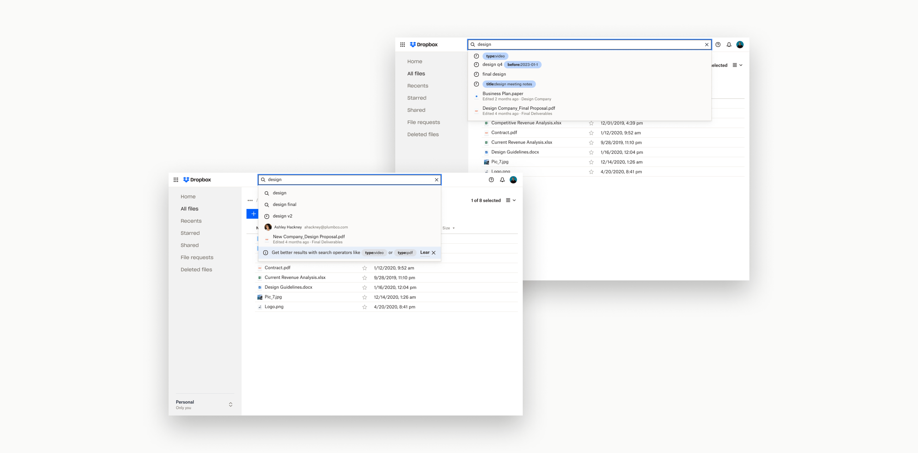
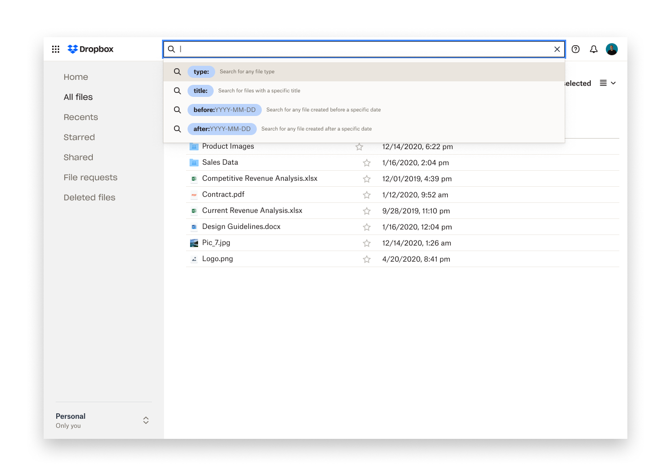
Phase 1: Introduce and validate


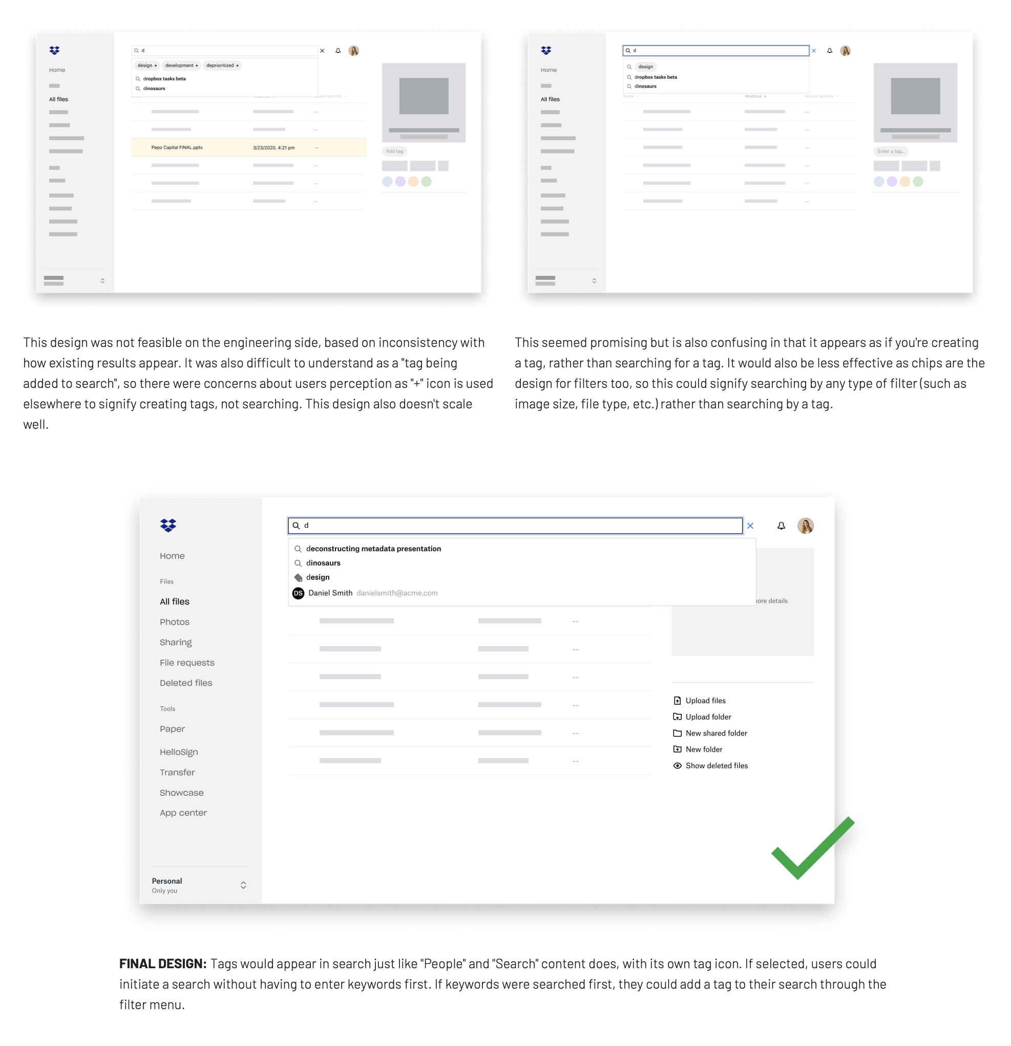
Phase 2: Contextual education
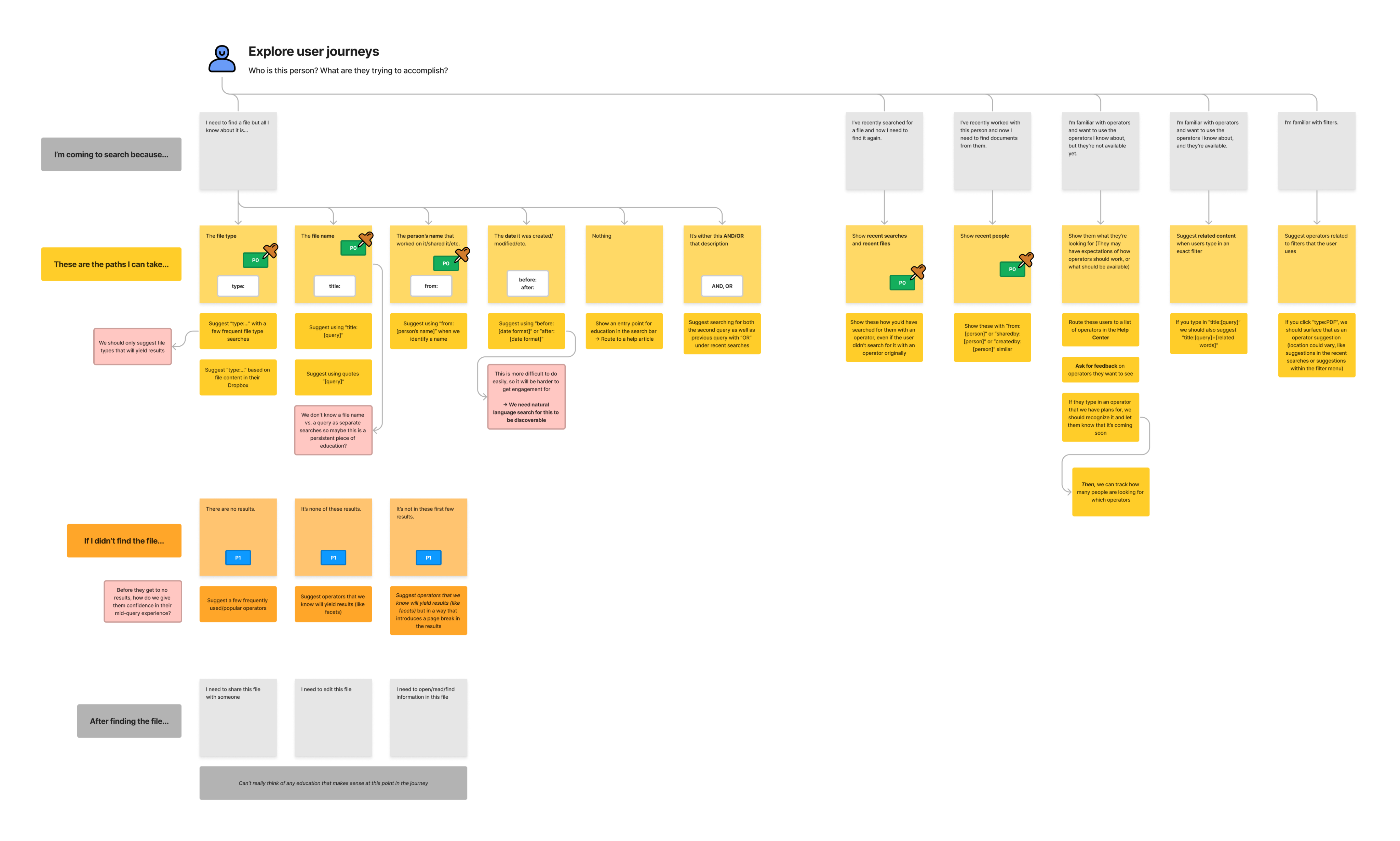
Phase 3: North Star vision
Impact
Upon launching Phase 1 of this feature, we saw an average of 200-300k queries per day 🎉
As we work through the remaining phases, we also wanted to explore whether we saw an improvement in users’ time to success. We qualify "success" here as taking a qualified action, like editing or sharing the file. Before investing more heavily into education, we used the first phase of this design to gauge whether we see any improvement to the search experience for a small sample of users. If that test showed statistically significant results, we'd move forward to the next design to increase adoption of search operators (aka make operators discoverable to those we believe will benefit from them).
Reflection
This project started as a request to catch up with competitors. But by reframing the problem and grounding it in user research, we uncovered a broader opportunity: helping all users refine their queries and find what they need with confidence.
It also reinforced the importance of pairing functionality with education. Operators alone weren’t enough. Users needed contextual guidance, feedback, and validation to trust the system—and ultimately, to adopt a new way of searching.
Hey, there’s still more to see ↓
Dropbox Metadata
One small MVP, one massive retrieval problem
Return to Home
Dropbox Search Operators
Reducing time-to-success in Dropbox search for millions of daily active users
Project overview
On the Search team at Dropbox, we were focused on how to enable our users to spend less time searching, and more time doing. We saw an opportunity to implement a highly-requested feature, so I sought to identify the real problem our users were facing, to see if and how it made sense to implement this feature.
The problem
Dropbox users couldn't find files they knew existed. The loudest feedback came from power users demanding Boolean search, but that was only a symptom, not the real problem to solve. Most users don't remember a file's exact name. They remember one clue: a file type, a rough date, a collaborator. Our search didn't support that mental model.
The reframe
I resisted the push to ship operator syntax as a feature checklist. The underlying need wasn't just mapping to industry standards for "Boolean search". What users really wanted was confidence in search results and the ability to refine a query without knowing the right vocabulary. That distinction shaped every design decision that followed.
My role
I led design from discovery through phased rollout, partnering with a researcher and two engineers. I was responsible for problem framing, concept exploration, experiment design, and cross-functional alignment on the phased strategy.
What made this hard
Operators are a power-user tool being introduced to a general-audience product. The design had to work for someone who'd never heard of Boolean search while remaining useful to someone who lives in the terminal. Discoverability and validation were the core design problems here.
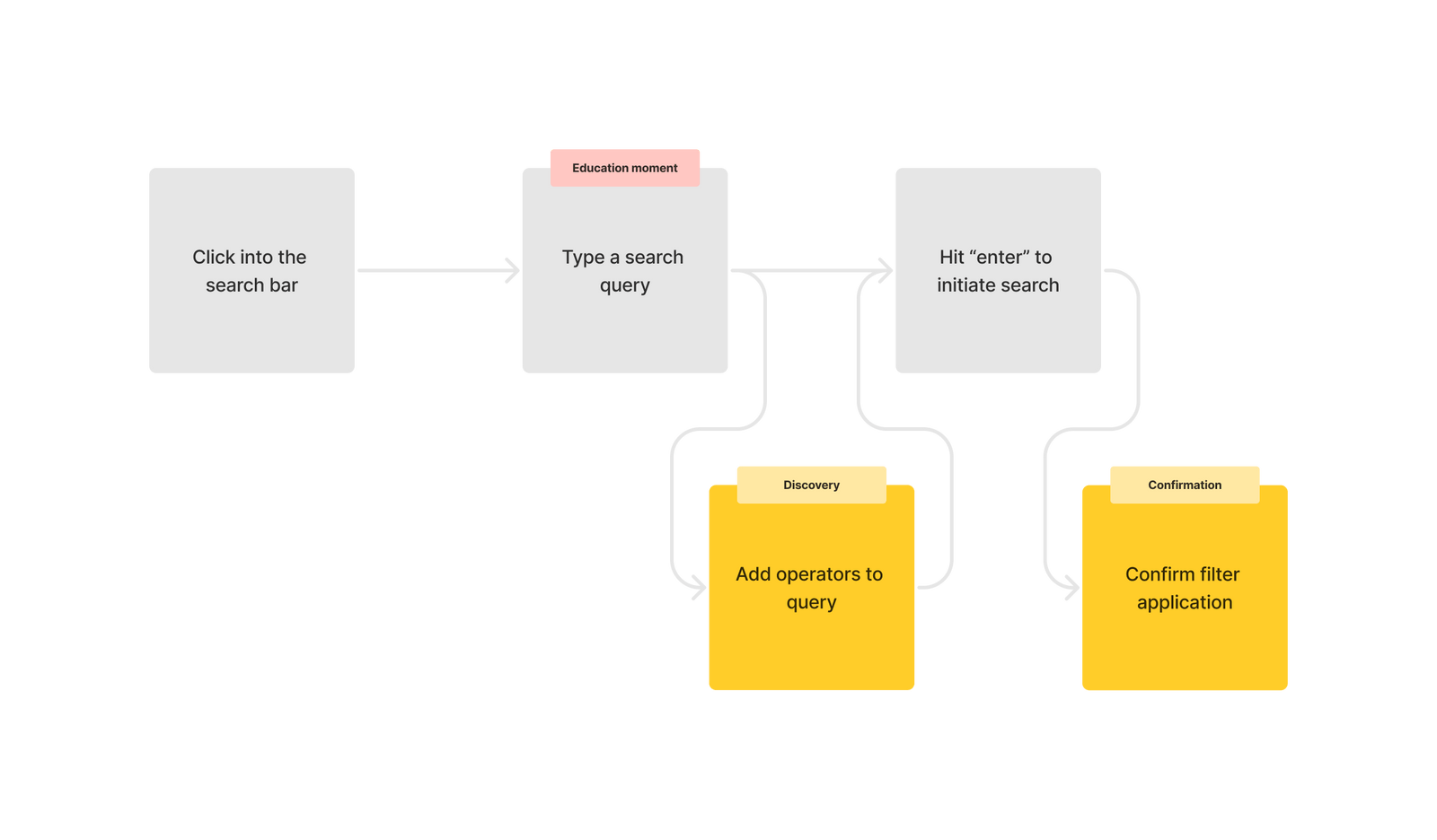
The design
I proposed a phased rollout to reduce risk and learn incrementally rather than betting on a single solution:
- Phase 1 validated that operators improved time-to-success for users who encountered them, using a minimal treatment. Mirroring filter selections as operator syntax in the search bar bridged the gap between familiar and new interaction patterns.
- Phase 2 introduced contextual education via suggestions at the empty state and inline hints based on query input.
- Phase 3 (north star) envisions a dynamic search bar that surfaces operator suggestions based on predicted result quality and prior searches.
Phase 1: Introduce and validate
Phase 2: Contextual education
Phase 3: North Star vision
Impact
Phase 1 launched to 200–300K queries per day. We used that volume to validate the core hypothesis before investing in broader education and adoption. This was a deliberate sequencing decision that kept the team from over-building before we had signal.
What I learned
Shipping phase 1 with a banner I didn't love was the right call. Getting real-world signal on whether operators improved outcomes mattered more than shipping a polished education surface into a vacuum. The phased structure also made it easier to get alignment across PM, eng, and leadership. Each phase had a clear hypothesis and exit criteria, which helped the team gain confidence shipping our larger vision.
Hey, there’s still more to see ↓
Dropbox Metadata
One small MVP, one massive retrieval problem